

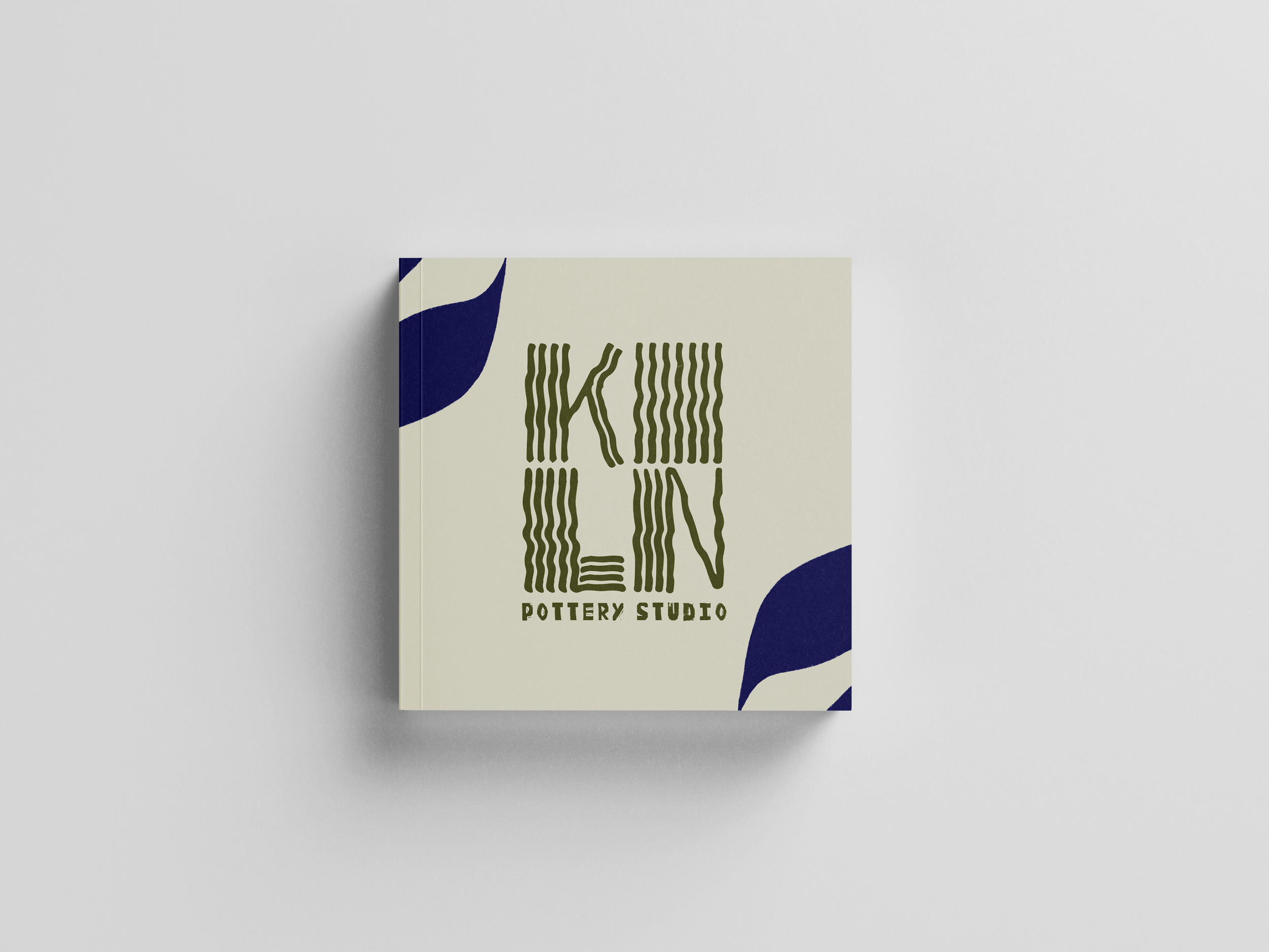
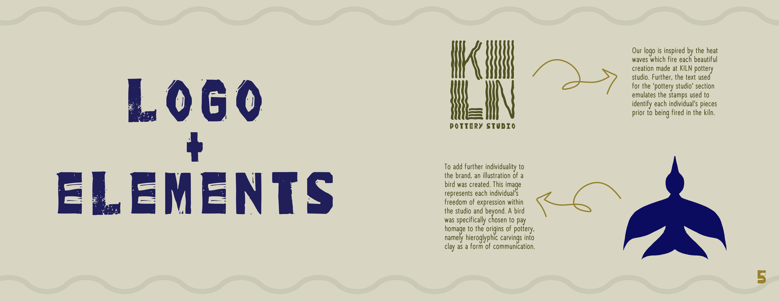
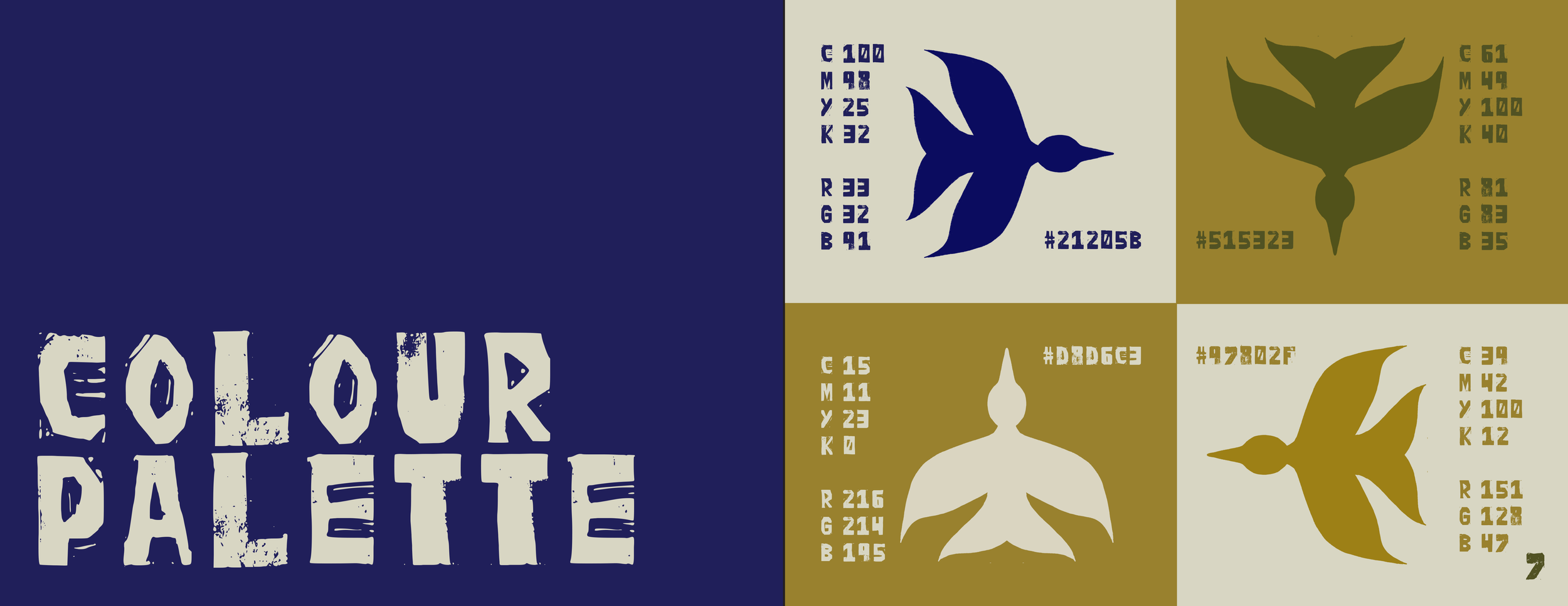
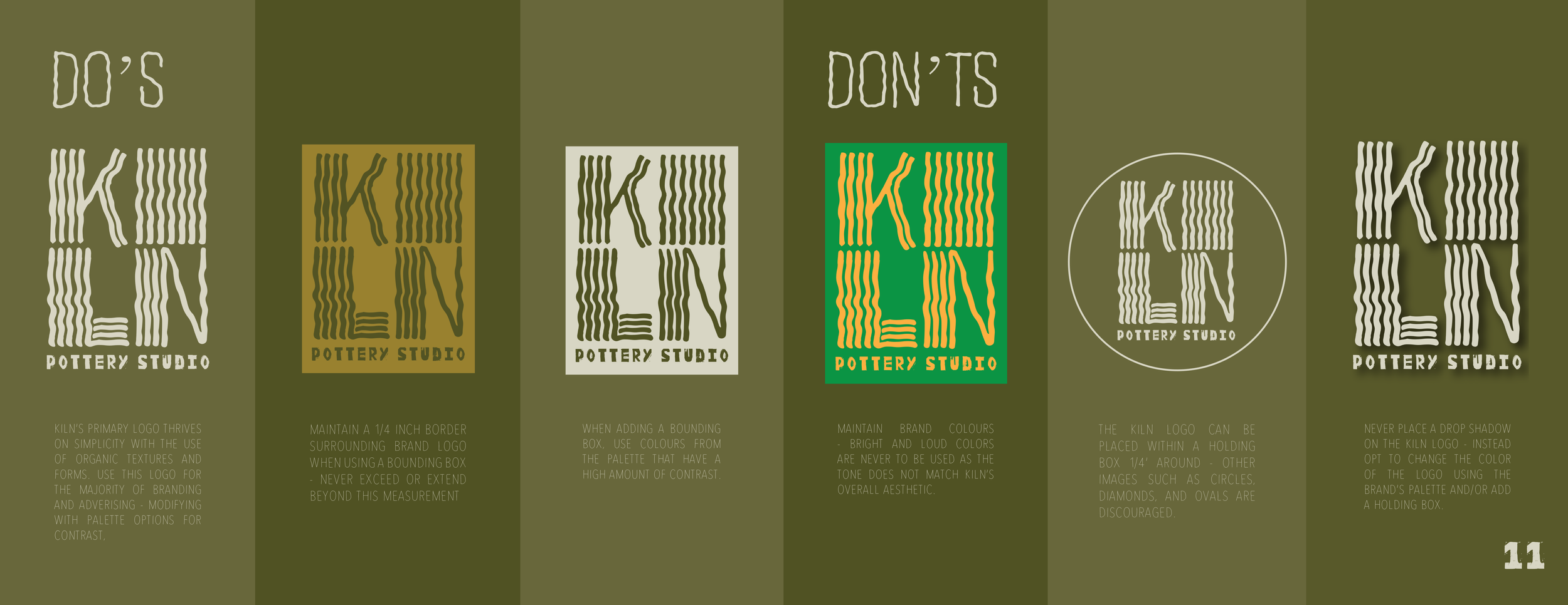
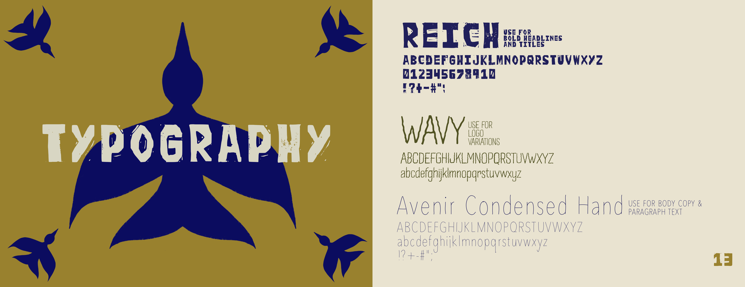
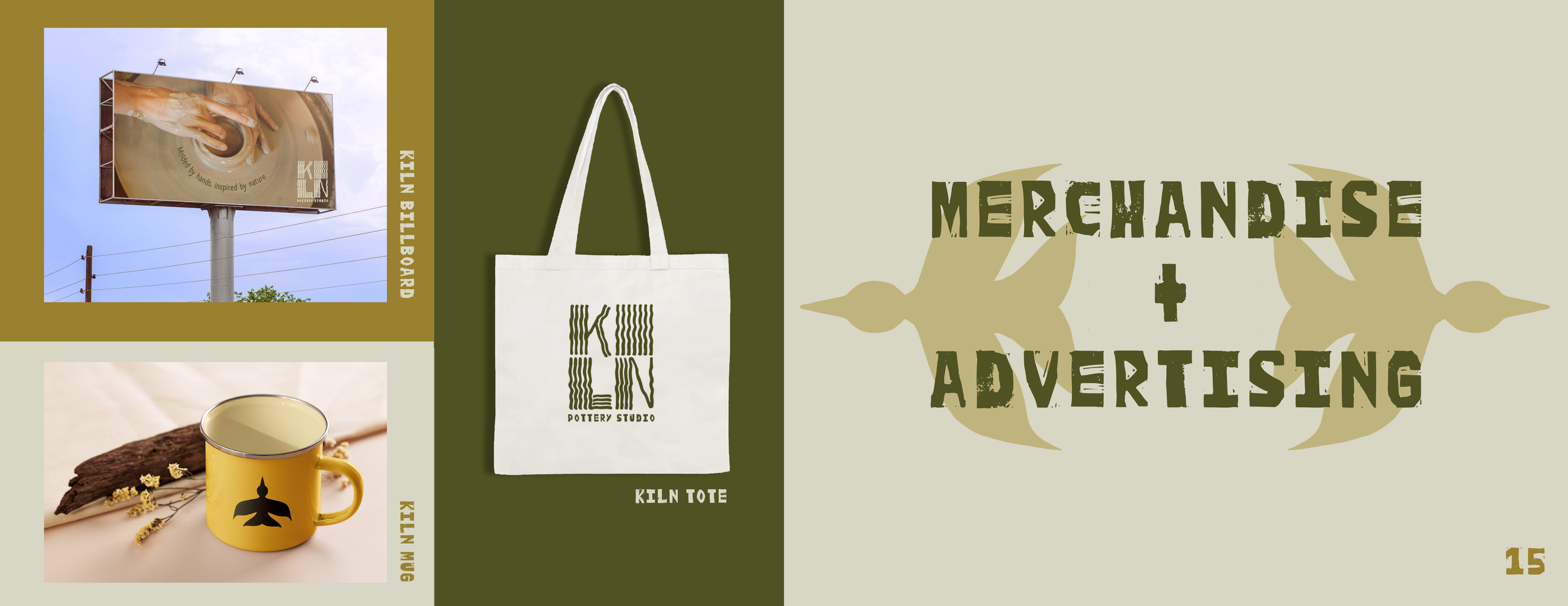
KILN is a concept pottery studio for creators of all levels. Beginning with the logo design, I chose to emulate heat waves from the pottery kiln itself. The logo was created through ragged lines formed to shape the word ‘KILN’, then placed in a square formation to appear as a stamp that could be placed on creator’s pieces. When deciding on a visual to match the logo, I chose a bird – representing the different states one feels on the wheel; freedom, connection and transformation. The color palette represents colors both commonly seen in the studio and in nature – brown, green, terracotta and blue. The overall mood I wanted to convey with this project was calm and serenity – things I personally feel on the wheel.