
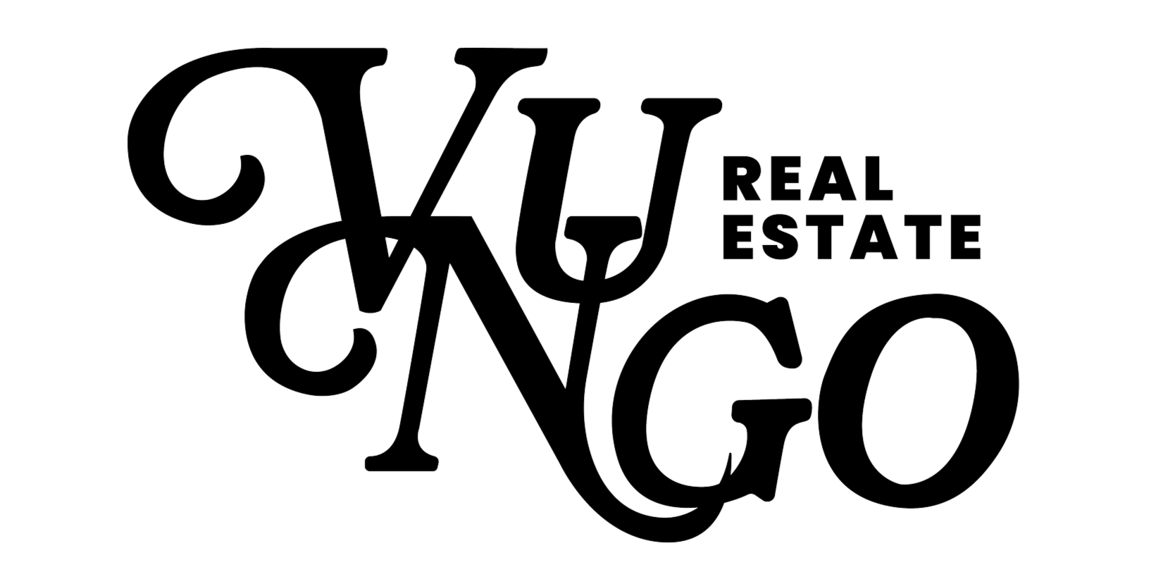
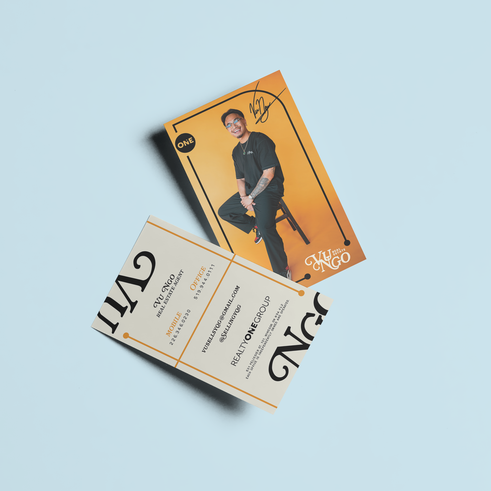
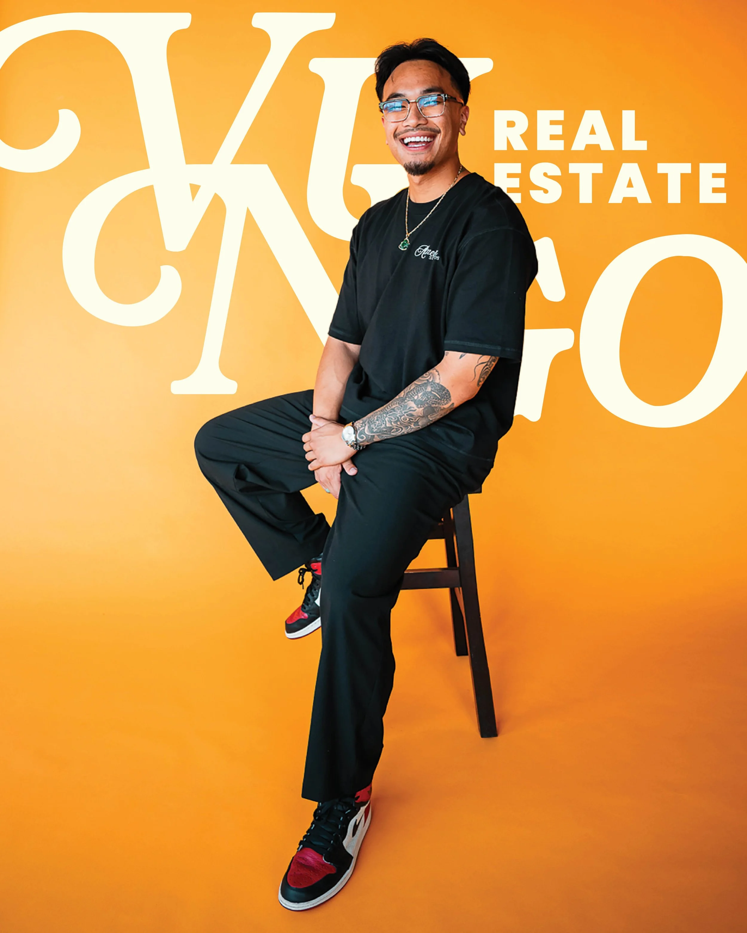
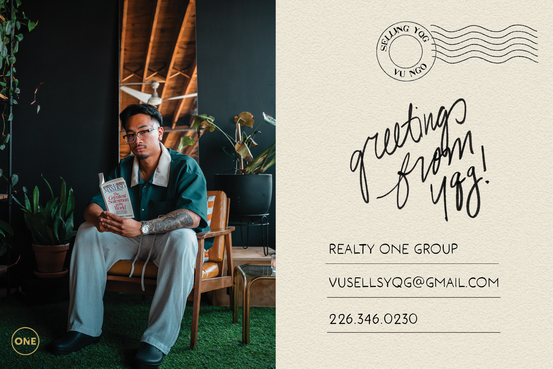
When Vu Ngo reached out to me to help with his rebrand, I was more than happy to help. Vu wanted an aesthetic that matched his style - taking nods from vintage basketball design. In redesigning his logo, I utilized a bold font - adjusting the ‘V’ and ‘N’ to give the name more life. We worked together to create a bold, citrus-forward colour palette that represents who he is as a person. For Vu, it’s all about the small, intentional details.